UWC Deutschland
A new online platform for the German UWC national committee.
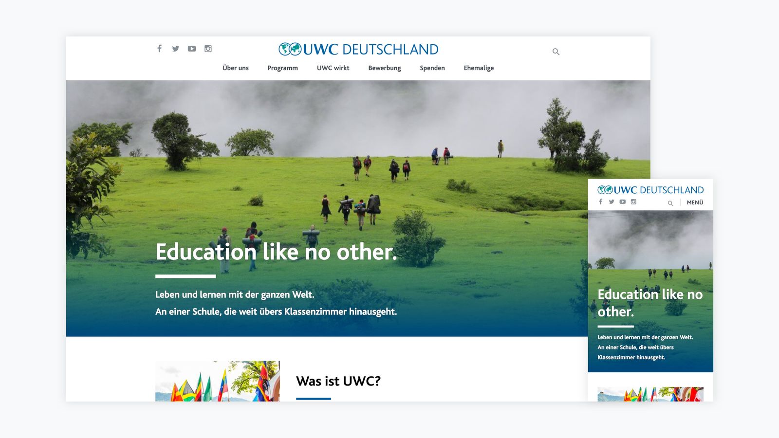
UWC Deutschland’s previous website dated back to 2007, the year the original iPhone was introduced and three years before responsive web design became a core concept of web development. Over the years, the website’s navigation structure had become a convoluted mess and the content was often outdated. So when I approached UWC Deutschland about a new website, they were excited to get started.
April — Kickoff and Planning
We kicked things off with a brainstorming meeting at UWC Deutschland’s office in Berlin. I guided the team through a series of short and focused exercises to quickly sketch out the goals and expectations for the project. Each exercise built on top of the previous one.
Target Groups
Everyone was tasked to identify three target groups that they deemed most important. We then combined the suggestions, discussed them in the group and boiled down the list to three main target groups:
- Potential applicants: young idealists looking to study abroad
- UWC as a movement: people looking for information on UWC (e.g. donors, parents)
- Alumni: former UWC students, teachers and parents
Navigation Structure
Before the meeting we had written the title of every page that currently existed on the website on a sticky note. This helped the team to keep a visual overview as they combined and grouped the pages according to their target groups, until an overall structure emerged.
The result was remarkable: we reduced the number of pages from 232 to 37, intuitively sorted into 6 sections.
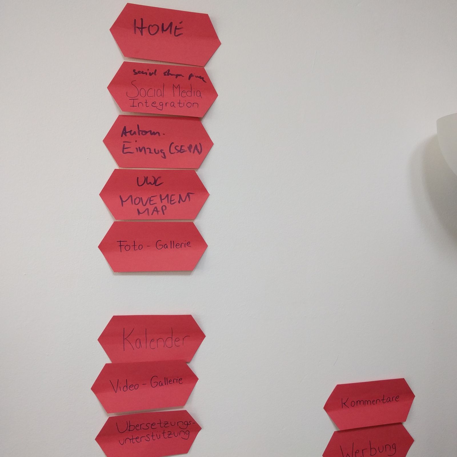
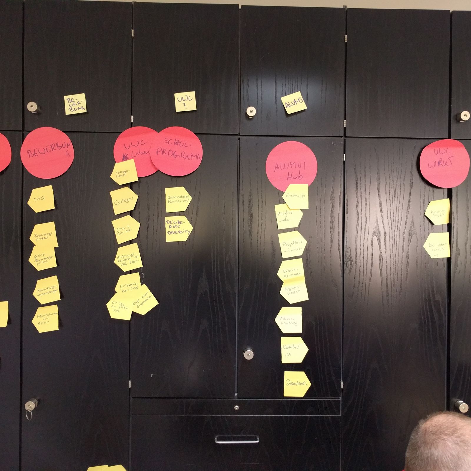
Visualised navigation structure on the left, feature list on the right.
Features
I had preselected a list of possible features to give the team a sense of what’s possible. I also encouraged them to add further suggestions. The team then ranked the features by urgency and importance.
Content Management System
In preparation for the meeting I had researched and pre-selected three content management systems: CraftCMS, WordPress and Squarespace. I had also set up demo sites for each CMS so the team could try them out and get a feel for the interface.
In the end the team decided to move forward with WordPress as it is open source, free, and has a large developer base.
May — Designing and Discussing
I spent the whole of May in Sketch drafting the design for the website. I shared my progress with the Berlin team through InVision where they were able to comment and discuss the mockups. They further shared the designs with members of the target groups. Their feedback in particular was extremely valuable and helped me to optimise the design further.
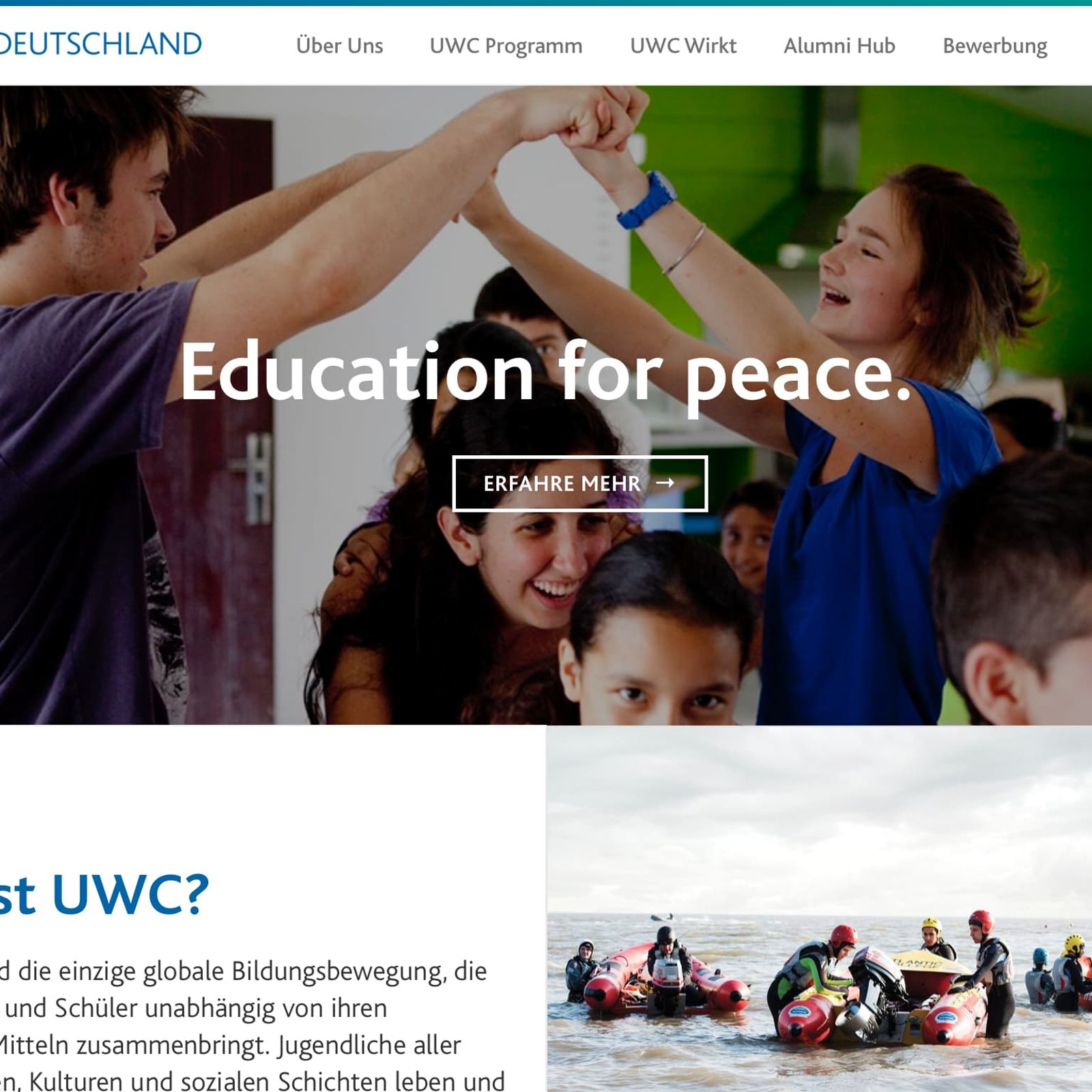
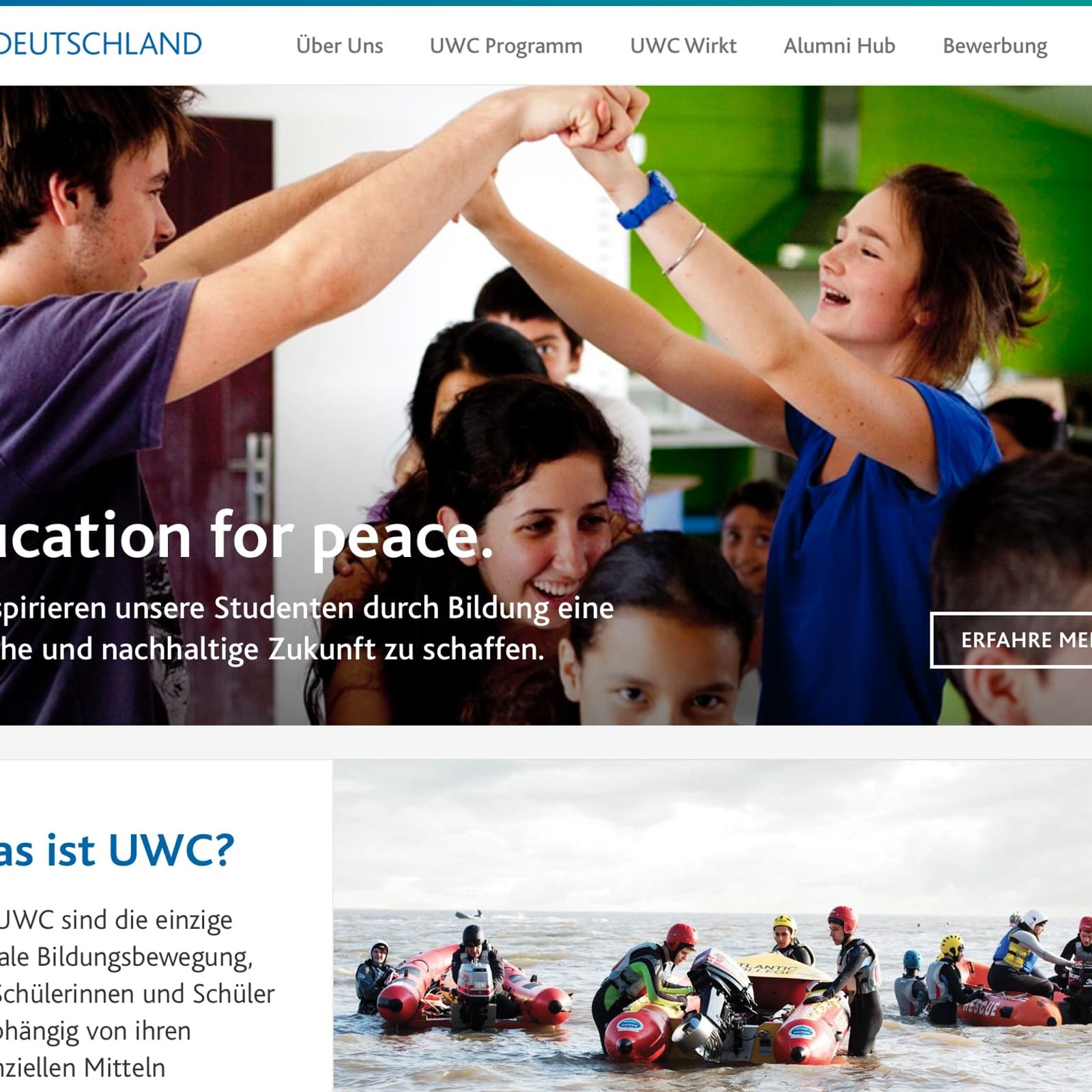
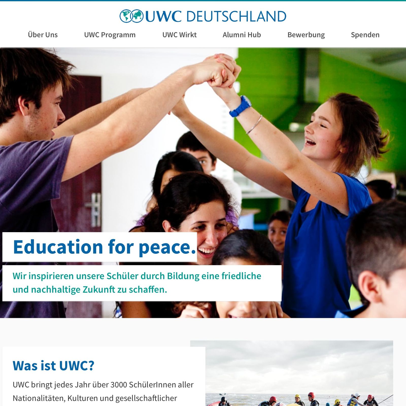
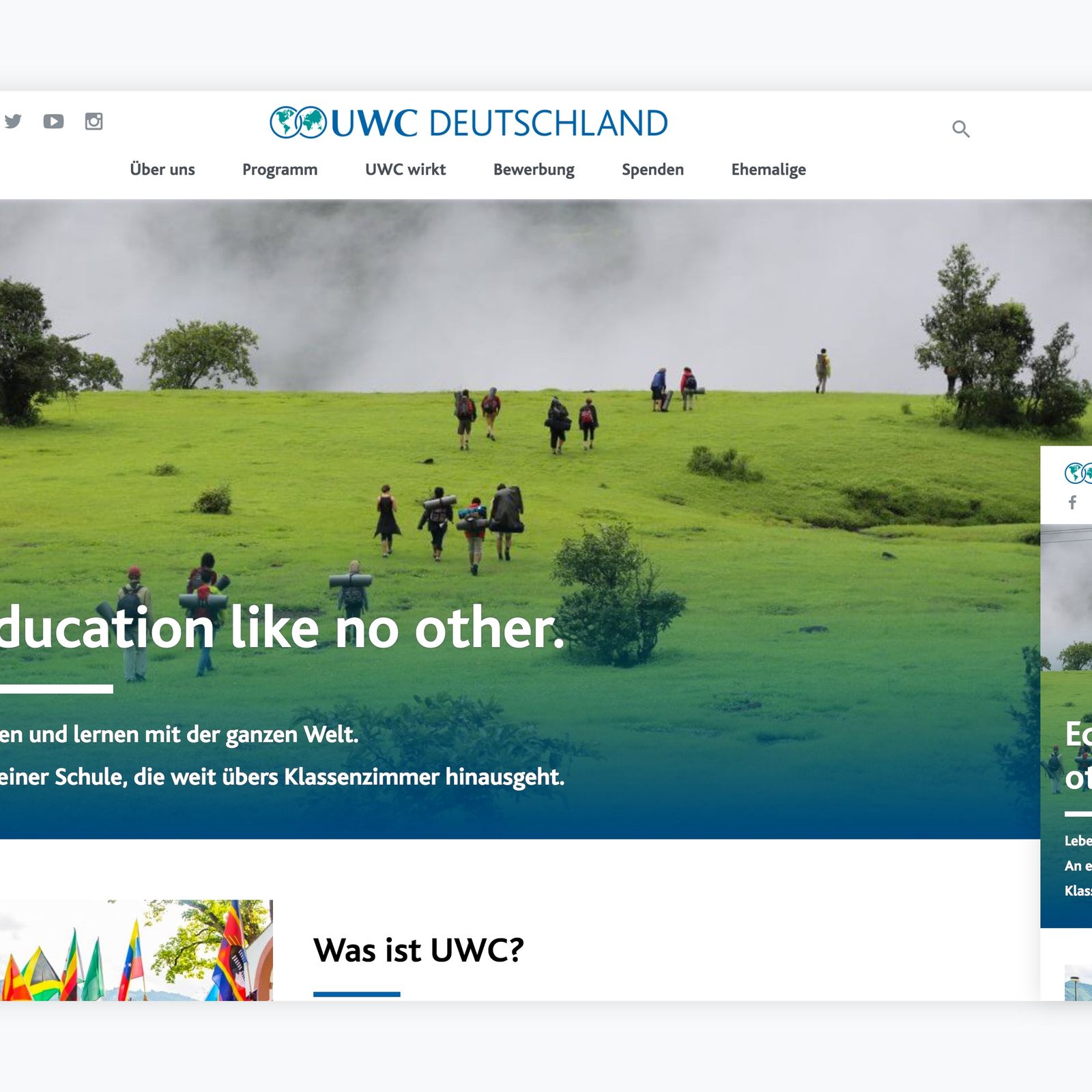
Evolution of the homepage design.
June to July — Coding
I spent the most part of June and July getting comfortable with WordPress and coding the theme. Learning by doing is my preferred way of, well, learning. This project gave me the opportunity to hone my CSS skills, dive deeper into accessibility and performance optimisations, and it challenged me to build a modular and extensible application. The theme code is open-source on GitHub.
August — Content Migration
As the new website neared completion, we began filling it with content. Most of the migration was done manually, since we edited and reformated the content while moving it to the new WordPress site. The new design placed a bigger focus on visuals, so I sifted through hundreds of images to pick the best ones for the new full-width page heroes.
The last step was to set up the hosting. I configured a DigitalOcean droplet from scratch which taught me many things about server performance and security. The static pages are prerendered and cached to minimize the server response time. I wrote several scripts to automatically install security updates and create offsite backups nightly.
September — Launch
In the beginning of September, we put the finishing touches on the website. The last bit of the puzzle was an email server that was attached to the old website and domain. I worked with the previous hosting company to update the DNS settings to ensure a smooth transition. Finally, we flipped the switch and the new website went live!
The response was overwhelmingly positive. We got feedback from parents, students, and alumni that information was easier find, the design looked fresh and appealing, and it was finally accessible on mobile.
Takeaways
Good planning saves time.
The initial kickoff meeting was crucial to align everyone’s expectations and define a clear vision for the website. This allowed me to deliver quickly without any drastic changes from the original plan. Short feedback cycles helped to refine the website further.
Don’t underestimate the time it takes to learn a new tool.
I like a challenge and usually select projects where I have ~70% of the required knowledge and pick up the rest as I go. This pushes me out of my comfort zone to learn new things. However, I shouldn’t underestimate the additional time that’s needed to complete such a project.
